Category Archives: Design

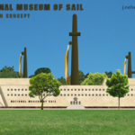
Proposal – The National Museum of Sail

Posted on by

NMS-iconAhoy! My latest design sketch, draft, or preliminary concept once again falls into the broad “civil planning” category.

I propose a new Smithsonian museum dedicated to the history of sail. Although this might seem like a niche subject, not only does the history of sailing cover the majority of human history and the majority of the Earth’s surface, but the United States was conceived and born through the power of sail. Such a huge chunk of our vocabulary is derived from the culture of sail that there are entire dictionaries devoted to etymologically nautical words and phrases, like Peter D. Jeans’s Ship to Shore: A Dictionary of Everyday Words and Phrases Derived from the Sea.

In this proposal (really just a fun blog post) I’ll talk about why America’s early maritime history is important, and the interesting features such a museum could have, including graphic depictions.

_

Continue reading

Notional Corporate Logo Design – Musa

Posted on by

designI’ve been publishing a lot of design posts lately. Might as well get them out of the way, eh?


This particular logo (see below the jump) came to me in a dream. Oddly enough, in the dream, it was the logo for a milk distributor whose television commercial featured people in a conga line singing “Musa, Musa, Mu-sa!

I don’t claim to make much sense in my sleep. Continue reading

Category: Design

Notional Book Cover – Makitcha Precinct

Posted on by

A few days ago, while signing into some security-conscious website, I was presented with one of the most awesome CAPTCHAs ever.

If you’re unfamiliar with the term, let Wikipedia explain it:

A CAPTCHA (an acronym for “Completely Automated Public Turing test to tell Computers and Humans Apart”), a trademark of Carnegie Mellon University, is a type of challenge-response test used in computing to determine whether or not the user is human.

They’re those graphics with the squiggly writing you have to figure out to log in.

Well, this time, the CAPTCHA I got was “MAKITCHA PRECINCT,” which I thought would make a great title for a novel. To prove the concept, I quickly threw together a couple of book cover ideas, one for a sci-fi interpretation of Makitcha Precinct and one for a thriller.

And yes, the promo quote is supposed to be funny. Meh, I try.

MakitchaPrecinct-scifiMakitchaPrecinct-thriller

Category: Design

Notional Corporate Logo Design – Qunbur

Posted on by

designI haven’t posted a logo design since the Skrew Werks Hardware logo, although I have had a few ideas.

One that has been rolling around in my head for a while is based on the graphic beauty one of my favorite Arabic words, قنبر or qunbur (pronounced to rhyme loosely with “run burr”), which is a colloquial term for larks.

I thought it would make a catchy name for a corporation that does work both in the Arab and Western worlds, and would lend itself to a nice clean, semi-symmetrical logo, something with a bold look and simple color scheme.

Also, as with many companies that cross the Arabic-Latin literary divide, it would require two versions, one in each alphabet. Here is what I came up with: Continue reading

Category: Design

More train talk! (I know, I am sorry.)

Posted on by

designWith Union Station getting a make-over due to crowding and WMATA constantly in the news, I felt it was time to talk about trains again.

And, to kick it off, there’s a predictably myopic pro-private* critique of the DC Metro system over at the United Liberty website, laying out “5 Policies keeping WMATA Dysfunctional.”

Continue reading

Category: Design

Wrangling a few more points about US Rail

Posted on by

designThere’s very little serious discussion these days on what to do about US passenger rail service, outside the occasional silly swipe about Amtrak’s low ridership compared with the much more generously subsidized air travel and highway systems, or a smarmy comment about railroad nostalgia.  It’s a bit idiotic, really, to blame nostalgia for encouraging America to keep up with the high-tech bullet trains of other countries, and only slightly less idiotic to expect an anemically supported mode of travel to run neck-and-neck with the steroid-pumped, oil-promoted interstate highway system.

But, these tend to be the twin drums beat by the anti-rail crowd, and the accompanying arguments are usually no less lacking in reason or vision.

For example, about a year ago the Freakonomics blog published a fairly comprehensive selection of recent commentary on US passenger rail, with a title that couldn’t miss the point further if it tried: “Can Amtrak Ever Be Profitable?”  Continue reading

Category: Design | Tags: , ,

Bloomberg weighs in on reforming US rail travel

Posted on by

OneAmericaA few days after I proposed an expansive design to reform US rail travel, Bloomberg proposed some smaller scale reforms to help get Amtrak back on the rails. Continue reading

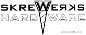
Notional Retail Logo Design – Skrew Werks Hardware

Posted on by

Speaking of outlets for creativity that I don’t often publicize here, I also do some amateur design work.  Some of it is obvious in the form of book covers and promotional graphics.  Most of it, however, I typically keep to myself. Perhaps I should share.  For example:

If I were to open a small-scale hardware store (there still are small-scale retail outlets, right?) I would give it the catchy, quirky-fun, palindromic name “Skrew Werks” and use this logo:

SKREWWERKShardware

Category: Design

One America – A New Vision for US Rail

Posted on by

OneAmericaAmerica should not have a world-class passenger rail system. America should have a world-aweing passenger rail system. Rail travel is central to American history.  In fact, one reason our railways are so technologically behind those in other countries—where bullet trains reach speeds of 300+ km/hour—is that we Yanks started laying track so early.

However, that’s only one reason. Other reasons include private sector profit impatience (no appreciation for long-term business goals) and a lack of political will to drive public investment. These all fall into the category Failure of Vision: people of vision no longer control the resources in the United States. We should really do something to remedy that, but in the meantime let me offer a new vision for US rail travel, which I call “One America.” Continue reading

Time For New Metro Leadership in DC

Posted on by

designAfter Washington, DC, is again ranked the worst city in the country for traffic (and doomed to get worse) and the DC Metro system trapped thousands of commuters underground, under a river, under sea level, in the dark for over two hours (read a horrifying first-hand account here) … it is clearly time for new leadership with a new vision at WMATA. Continue reading