 I haven’t posted a logo design since the Skrew Werks Hardware logo, although I have had a few ideas.
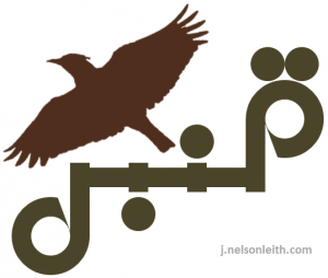
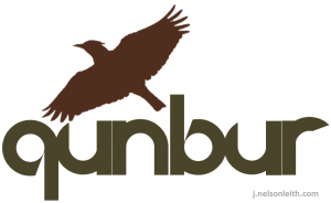
One that has been rolling around in my head for a while is based on the graphic beauty one of my favorite Arabic words, قنبر or qunbur (pronounced to rhyme loosely with “run burr”), which is a colloquial term for larks.
I thought it would make a catchy name for a corporation that does work both in the Arab and Western worlds, and would lend itself to a nice clean, semi-symmetrical logo, something with a bold look and simple color scheme.
Also, as with many companies that cross the Arabic-Latin literary divide, it would require two versions, one in each alphabet. Here is what I came up with:


