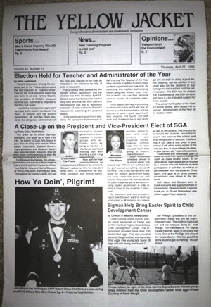
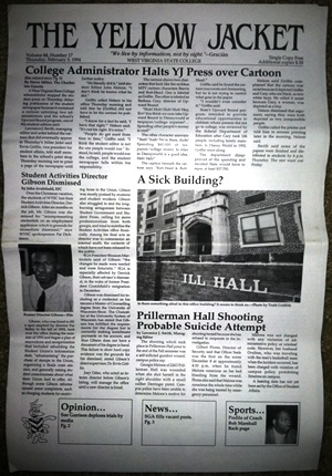
 When I took over as editor-in-chief of the West Virginia State student newspaper, The Yellow Jacket, I made two key changes to the format, intended to give the paper a sleeker look.
First, I replaced the clunky four-column format with five slimmer columns that enabled more photo embedding options. Then, I replaced the Times font with Palatino.
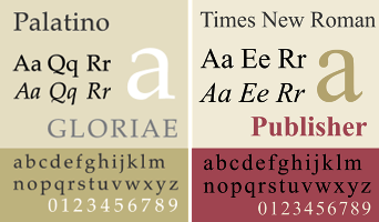
 It may look like a subtle difference, but to a font dork like me it was a difference worth making. The left-facing letters of Palatino (compare a, j, and q) present fewer obstacles to the right-moving eye than in Times, and Palatino’s right-facing letters (check out f and r) let the eye slip to the next letter rather than tripping it up with a blunt hook the way Times does.

 Hermann Zapf, the man who designed the highly successful Palatino font as well as the popular Zapf Dingbats, died earlier this month. His work can be found not only in my old school newspaper and in publishing software all over cyberspace, but on the Vietnam Veterans Memorial in DC, which uses Zapf’s Optima font for the names of the Americans who died in that war. May Zapf also rest in celebrated peace.
At left: the paper as I inherited it vs. the paper as I re-envisioned it.
